
002 - Things I’ve learned with cyanotypes
Over the past 6 months, I’ve had cyanotype printing on my mind almost daily. This post puts together a number of things I’ve learned during this time.

I used to play with cyanotypes a few times per year. I’d go into a frenzy and make 10-15 over a few days, but then wouldn’t touch them for a few months. However this changed last fall.

During a very busy time at work, I started a series of cyanotype prints called « while at work ». The goal was to print flowers and plants during the days where I was at the office, days when making art was a little more complicated, because of time constraints.
I ended up with a regular cyanotype practice. This regular practice made me fall in love with this medium and wanting to try more things and explore it a little deeper.
If you are new to cyanotypes, you might want to read this article about making cyanotypes with a kit. I wrote it after trying cyanotypes for the first time. That is when I did get hooked on the process!
the plan for the article
So you know what I’ll be rambling about throughout this article! ;)
About the light
A daily project
Things I’ve learned
Prepping the paper
Exposure time
Developing the print - rinsing it well
Developing the print - Toning a print
Drying the print
Accidents and mistakes
Things to test more in the future
There is no « one way » and no perfect way
Further reading on cyanotypes

About the light
Usually when you see instructions about cyanotype printing, they will tell you to expose your print around noon on a sunny day, and out in the sun1.
While it is true that this is the quickest way to expose a print and will yield the « crisper » results, I’ve always played with exposing my paper during snowstorms, during winter, on rainy days.
Results will vary, and sometimes there are failures. But some results have truly surprised me with their softness and delicate nature and they are frankly beautiful.
Up to now, it has been a lot of guess work and experimenting (i know you are not really surprised by this if you know me!).

A daily project
During my project this fall, I flirted with the idea to turn it into a daily project. To see how the light would evolve daily. It was fall, daylight was diminishing everyday until the winter solstice… I kept wondering if there would be a time where I truly would not have enough light to make a print on my days at the office.
I had an idea.
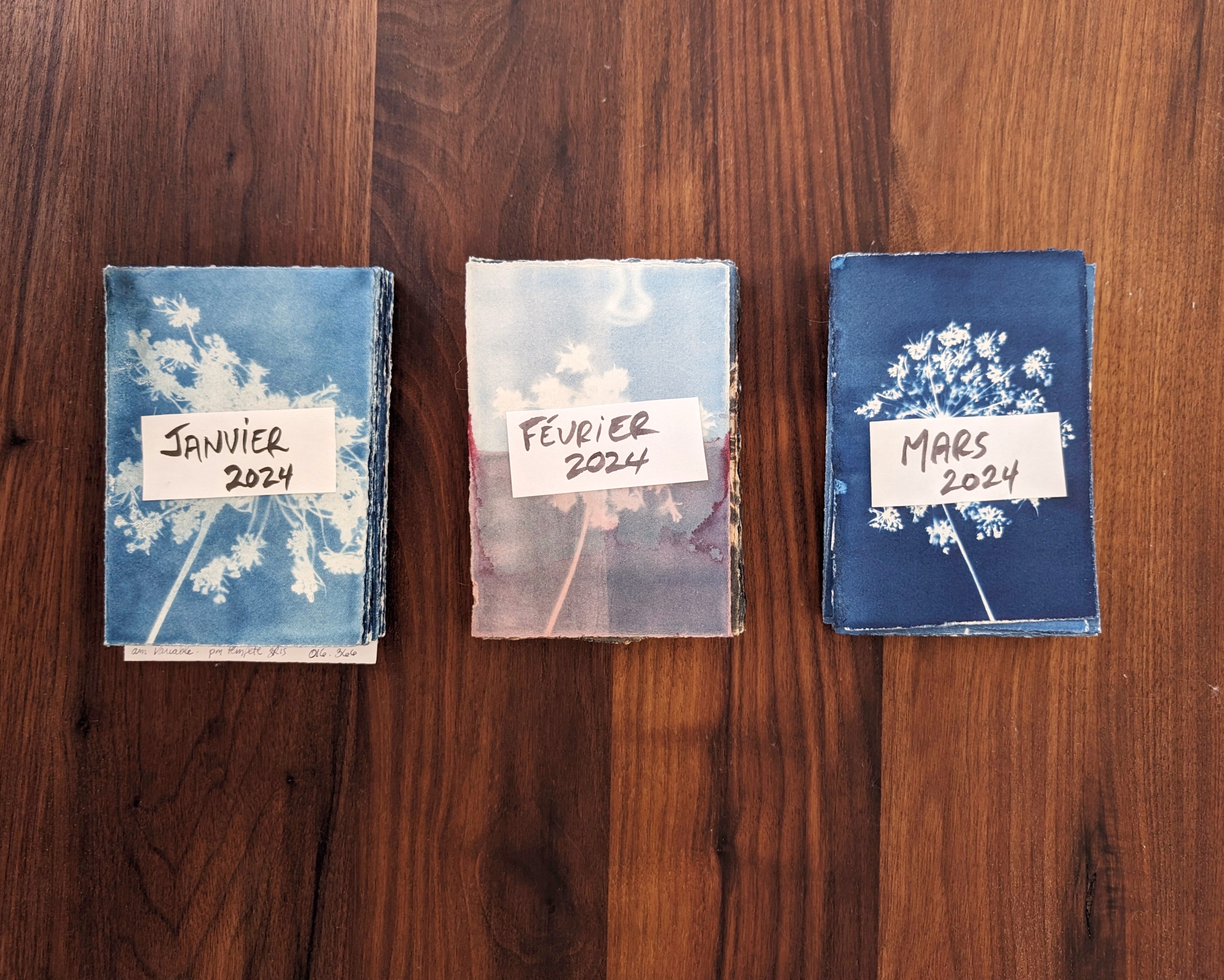
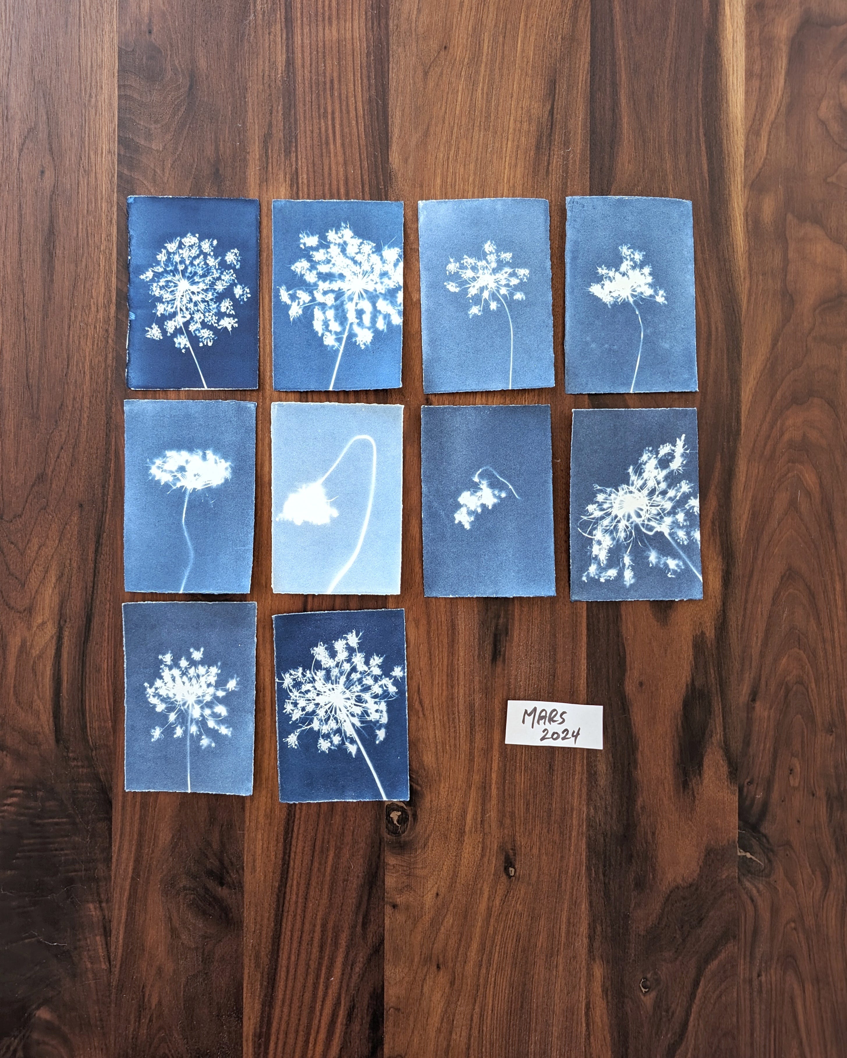
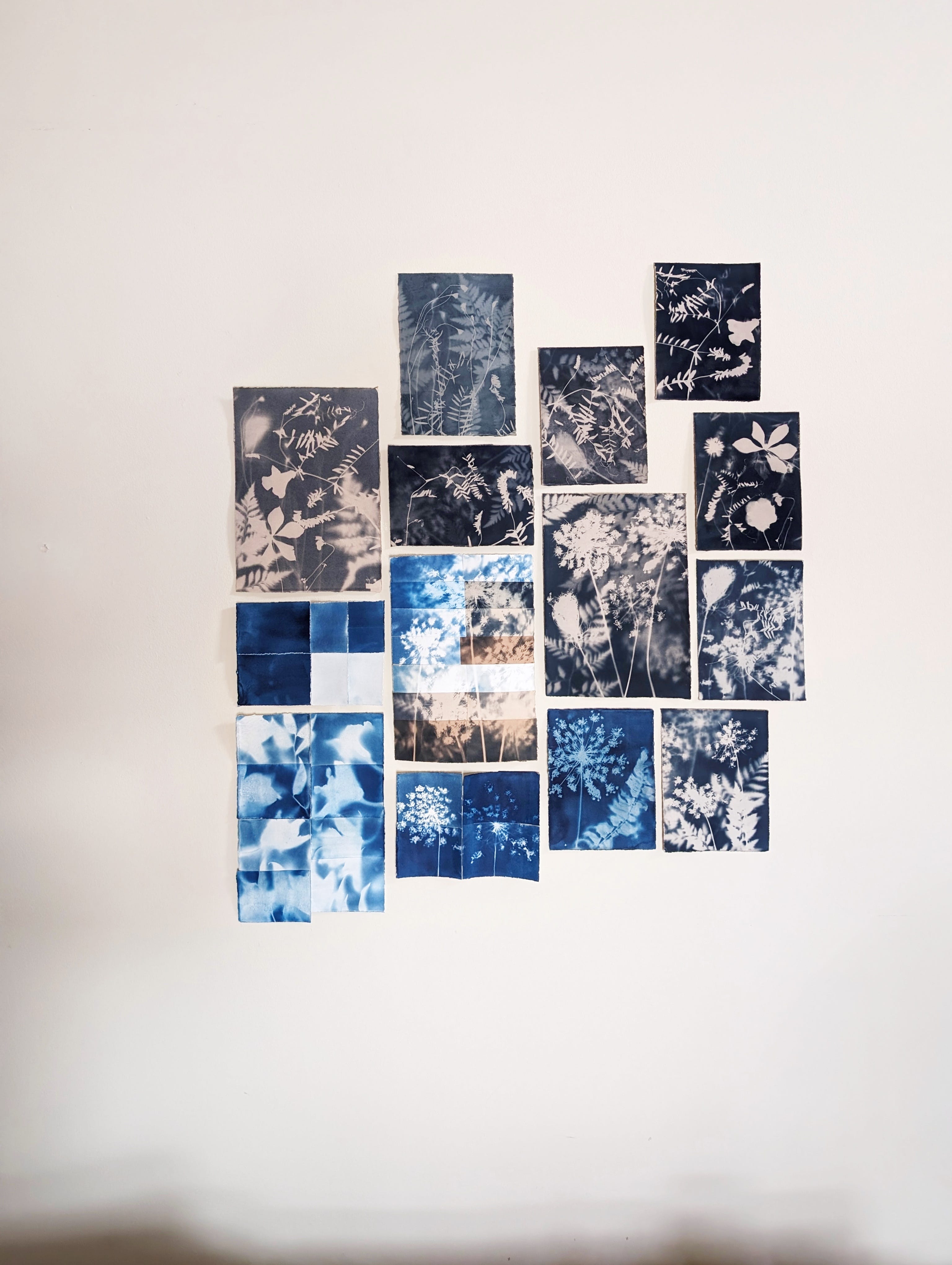
Every summer, I press many amazing Queen Ann Lace flowers. They look like fireworks in cyanotypes. I decided to make little portrait pieces with a daily flower. I thought I had an infinite number of these flowers…. it seems I have 22.

the 366 day project parameters:
hot pressed Fabriano watercolor paper
1/32 of a sheet
1 flower per day (repeats since i only have 22!)
the print stays exposed for the whole day, on my desk’s windowsill
I never thought I would actually continue with this project all of this time, but as I am writing this, 70 prints have been developed, no 71 and 72 are in a dark box, waiting for their turn and no 73 is out on the windowsill.

Things I’ve learned
Knowledge is gathered quickly when you develop a print a day, or more like a few prints every few days. You learn to see what works, what doesn’t. It is easier to compare with the last ones you made, as your memory is fresher.

Prepping the paper
A foam brush is my best friend.
Take your time applying the solution, brush strokes will appear on the developed print.
Apply the solution one way, and then make a second pass perpendicular (no need to add more solution, just with the same already loaded brush).
Once the solution is applied, let sit a little (like 30 seconds), then with the « empty brush », go over the paper a second time to smooth everything out.
Do this without much light, ideally at night. I do this at night, then go to sleep. Remember to put the dried sheets out of daylight and get up early the next day! ;)
Keep the coated paper out of daylight. I put my coated papers in a cardboard box, in a cupboard, in a room that has no daylight.


Exposure time
Even the darkest, most cloudy and short day will yield a print. It might not be the most blue one, it might not be the crispest silhouette, but there will be a print.
These are winter months, and there has not been much sun yet, and my window is a north-west orientation. I have not had an overexposed print yet. Or I have and I don’t know how to see it! So there are still things I need to experiment with in the coming months.
Developing the print - Rinsing it well
In the past, I have often had prints that were not rinsed enough so I sometimes went a little too far the other way and let prints sit for too long in water. This resulted in prints that were washed off (the blue part) or that have a sort of yellowish-green-ish puddle in the middle…..
Instead of simply letting the print in the water for longer and longer:
When dropping the print in water, agitate the water container. This prevents the washed off solution to actually accumulate on top of the print and stain your whites, or even blue parts of the print.
Face down in the water for the little prints helps also to prevent puddles. But then you don’t see the magic happening and that is half the fun! ;)
Solution that has been applied long ago is more difficult to rinse off. Solution that has been applied too recently washes off too quickly! There is a sweet spot to find. I have an experiment lined up to know more soon.
Rinse off the print with running water once you pull it out of the bath. Watch the draining water after this on your hand and see if it is clear.
A simple print of a small size doesn’t need more than a few minutes. Not an hour-long bath like I’ve done in the past…. though with solution applied a long time ago, it might be necessary.
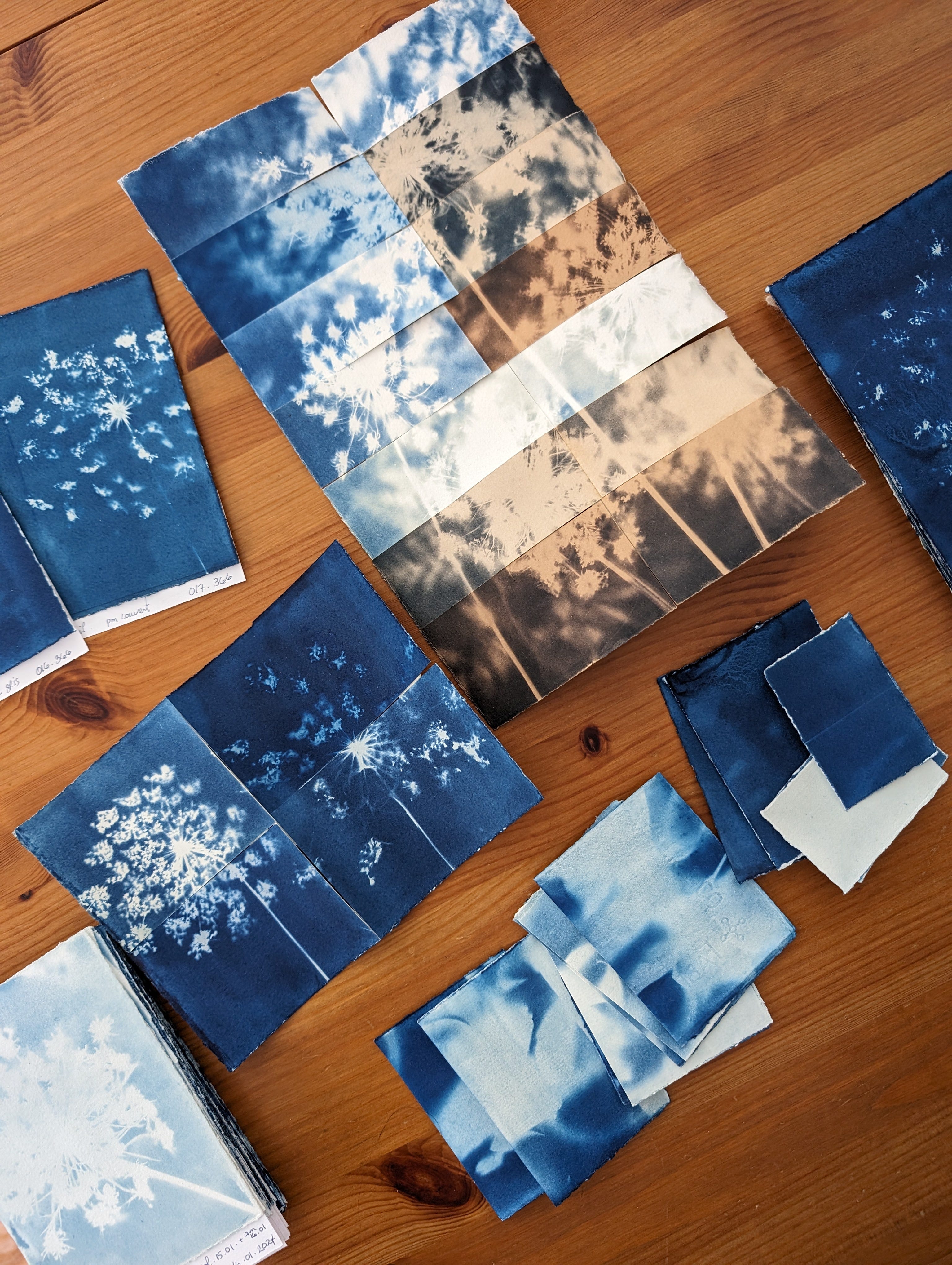
Developing the print - Toning a print
There are many toning liquids to choose from, and I’ve tried only a few. I discovered this part of the process by reading this resource from Jacquard products.
This has been sooo interesting to play with.
I first approached this toning process once again with a sort of scientific approach. I made this larger piece that I exposed, and then cut it into pieces that were developed and toned with different solutions. And this piece was also made with a friend, which made the whole process even more fun!

The results were impressive enough that it catapulted me into making the whole month of February about this process. But I was quickly reminded of a lesson I’ve learned again and again in art making: letting go of expectations.
There are so many variables to account for, it is difficult to reproduce exactly a shade of color from one print to another. And to be honest, if I could accomplish that, knowing myself, I’d probably get bored and move on to something else!
In this section, I will share the things I have observed up to now, but keep in mind that results vary because of a number of different parameters, among which:
regularly washed prints (water only) vs acid or bleached prints,
how exposed is your print,
how diluted/concentrated your toning bath is,
wether you let the print dry and oxydize before putting in toning bath,
probably the ph or quality of your tap water,
if your baths are clean or if it is the 10th print that day,
how long you let your prints sit in the different baths,
the order of the baths.
This can be overwhelming or totally fun. I choose fun. I am slowly experimenting with everything, from time to time making different tests.
On to the fun observations and discoveries!
Vinegar/acid : makes the blues pop more
I use citric acid, food grade.
AGITATE. That’s when I realize the importance of agitation. Or else, the blue the acid takes off will stain your whites.
I prefer to wash a little with water first, then acid, not for too long.
Do not use metal containers, or at least, cheap metal plated cookie tins… they might rust!

Bleach : makes the whites more crisp, dulls the blues
I use soda ash, the stuff for lake pigments.
AGITATE. It applies here too.
I’m still on the fence about this one. It dulls the exposed parts. The parts that stay white, well are already as white as the paper.
Easy to add too much and damage your blues though: there are some little white specks that can appear in the blues (like granulation in a photograph).
I did not try the metal cookie tin here, so I can’t tell you if it would make it rust!
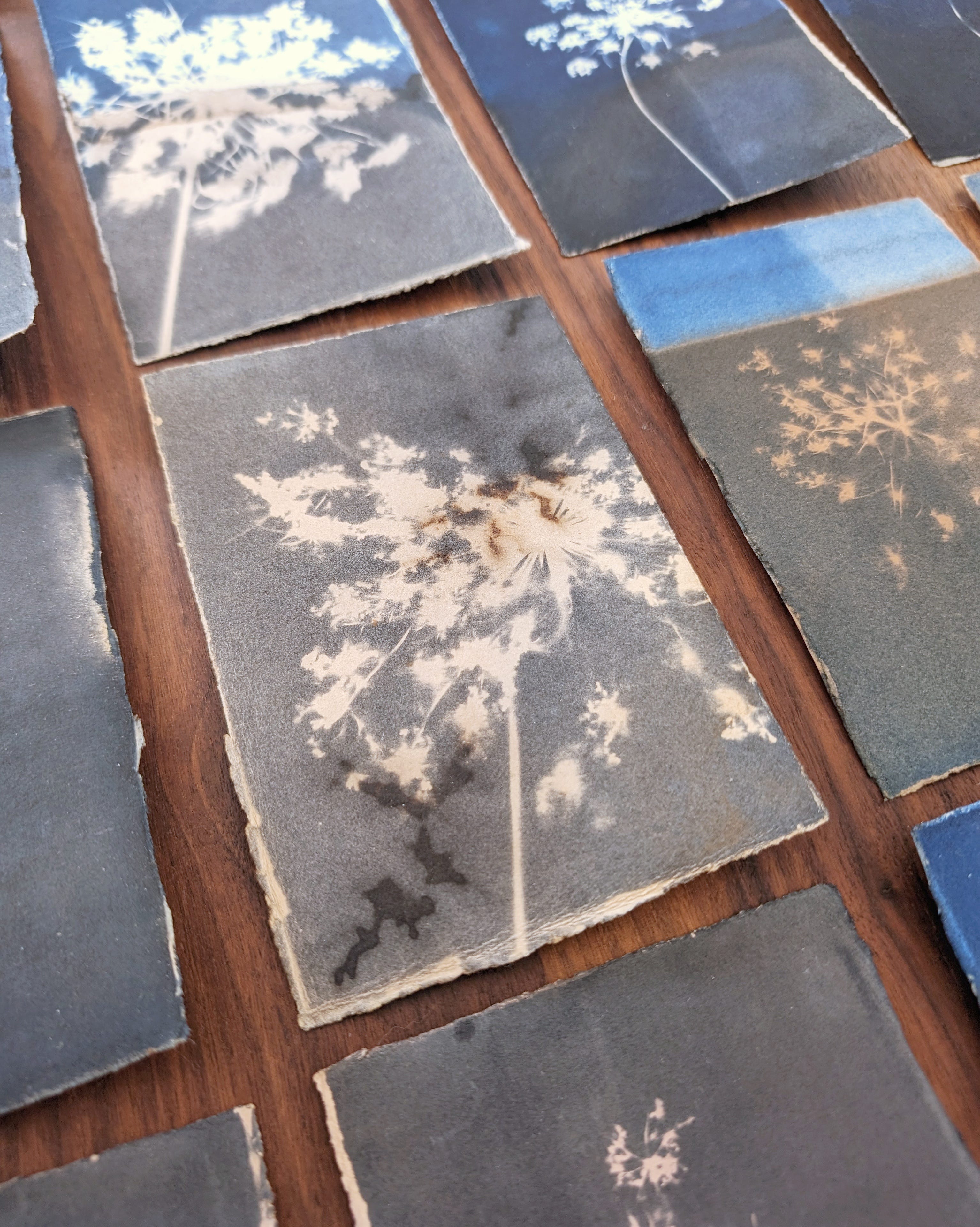
Coffee :
I usually keep used coffee grounds and infuse them again to take color out without wasting coffee (no wasting coffee happening here!). For ink, I then concentrate it.
Have yielded a range of almost black to indigo colored prints. INDIGO! :)
Lighter baths (more diluted coffee), with shorter bathing times (like 30-45 minutes) will tone the blues, not so much the white parts. Longer bathing times (like overnight) will change the color of the whites as well.
I like them a loooooot.
The used coffee from a cyanotype bath will show mold after a few days (i have not yet tested how this changes the color!)
Face down is important, as that way, the print is in contact with the bath, and there are not weird « ripples » on the print.
A print made with some coffee grounds left on the print with a shallow bath of coffee made for interesting texture.

Tea / Black, Rooibos tea, Green tea, Oolong tea
I have quite a collection of teas I used to drink. For some reason, I have collected more than I can drink, and some are even older than my kid, who isn’t even a toddler anymore. I don’t want to drink them, but they do smell amazing!
Each have very different toning effects, and the color shift is sometimes surprising.
Hibiscus flower tea :
Hibiscus flower tea I bought for making lake pigments and somehow never did.
Yields a very soft pinkish hue. Must be in the bath for at least overnight to see a lovely pink hue. I suspect there will be no lightfastness here.
Hibiscus flower tea / coffee / tea mix:
I decided to mix a solution from black tea, coffee and hibiscus color. Because why not? I also thought maybe the tannins from the tea would make the hibiscus more present.
Yields a very soft pink/grey hue. Very interesting.
Onion / Shallot dye:
From onion and shallot peels.
Yields a very yellow brown color. Quite warm, and intense.

Drying the print
Having the prints dry over a paper towel (that you can reuse) make somewhat flatter prints than the ones left alone on the plexiglass to dry
Drying the prints between two plexiglass sheets….. they simply don’t dry and well, I need the plexiglass for other prints!
Once the prints are dried, if not flat, I spray them with a little water and then put them in a hardbound book I bought for art making and add weight over it. After a couple of days, super flat prints!

Accidents and mistakes
There are always accidents and mishaps which teach us a lot. Of course you don’t want to do them, but when they do, you learn the lesson and move on. And share the lessons so others know about them! ;)
A print in a puddle. I wasn’t careful adding water to my container and the print sat in a puddle of water for some minutes before I rinsed it off properly. I thought, well, it’s only water right? Nope…. something happened and the whole print just washed off. Weird.
A print that took a too long bath. I’ve learned that there is a point to which you can rinse off your print too much.
Paper that is too fragile. I have had paper actually almost dissolve in the rinsing bath. That was heart breaking!
A print with a greenish puddle… because prints can be not rinsed enough. In those cases, your whites have a slight yellow tint or there is a puddle or greenish hue that can form in the middle of your print. It wasn’t washed enough / properly. And it didn’t « drain » properly.
Things to test more in the future
There are so many things I want to make comparison tests, among which:
Different papers
Adding watercolors to the prints in different stages
Going mixed media with the prints
More in-depth trials with toning solutions
Arrow-root powder...
Different solutions from different companies
Different solution applications
Different length of time since the paper was prepped
There is no « one way » and no perfect way
There are ways to avoid mistakes, but there is not an ultimate way to do things. There are beautiful results awaiting in every situation, and horrible results even in the « best » of conditions.
Further reading
If this has intrigued you and you would like to read more about cyanotypes, or try it yourself, here are a few things you might want to try.
Toning cyanotypes by Jacquard this ressource from Jacquard products
About cyanotypes on AlternativePhotography.com, a great ressource for alternative photography processes
Let me know if you have questions, or if you want to start a little cyanotype project. I might also be willing to send you a couple of small coated papers for you to try! ;)
With love, remember to play!
Stephanie
There are also tools that can yield a more controlled results and which can be used in your studio, but I’ll stay with natural light here as this is what I’ve been using.